Welcome to the thrilling world of data science and machine learning! If you’re as passionate about data as I am, you’re in for an exciting journey. The image you see below is more than just a diagram—it’s a roadmap to success, guiding you through every critical step of building and deploying powerful machine learning models. From the exhilarating first steps of gathering and preparing data to the triumphant moment of deploying your model into the real world, this process is a blend of art and science, filled with challenges and opportunities at every turn.
Each stage in this cycle—vividly color-coded for clarity—represents a crucial part of the machine learning lifecycle. The orange segments signify the intense process of data ingestion, where you wrangle data from various sources and transform it into a form ready for analysis. The blue phases highlight the intellectual challenge of model training, where algorithms are meticulously tuned and refined to create predictive models. Finally, the green segments celebrate the culmination of your hard work: deploying and monitoring your model as it starts making real-world predictions, driving decisions, and generating value.
This isn’t just a technical process—it’s a creative adventure. It’s where your ideas come to life, where data becomes insight, and where those insights have the power to change the world. Let’s explore this journey together with enthusiasm and a relentless drive for excellence!

Let’s dive into the fascinating journey of data fetching! As you probably know, without data, there’s no machine learning magic. The initial steps in this process—fetching, cleaning, and preparing data—are the most time-consuming, but also exciting! These steps are usually iterative, meaning you’ll fetch some data, clean and analyze it, and then keep going back for more until you have exactly what you need. The goal of these steps is to gather all your data from various sources and get it into your modeling application (let’s call this our “system”), so you can start training your model.
Kicking off with data fetching, also known as data ingestion, let’s explore what that involves. Your data could be scattered across multiple places in different formats. You’ve got your structured data, like databases with tables of rows and columns. Then there’s unstructured data, which doesn’t have a defined schema—think images, PDFs, or videos. And somewhere in between, there’s semi-structured data, like NoSQL, CSV files, and JSON code. All of this needs to be brought into your system. But how do we get it all in there? If you’re dealing with a variety of data formats, a data lake is your best friend. For simpler or smaller datasets, like a single CSV file, you can upload it directly to your system. Usually, though, you’ll need to decide on the type of ingestion process. There are two main types: batch processing and stream processing.
Batch processing involves periodically collecting and sending data in batches, just as the name suggests. This can be triggered by an event or set on a schedule. It’s perfect when you don’t need real-time processing, like getting your data every few hours or once a day. It’s generally cheaper and simpler than stream processing.
Stream processing, on the other hand, is all about real-time data handling. Data is continuously loaded and processed as it comes in, thanks to constant monitoring. This is ideal for scenarios where you need real-time data, such as monitoring the performance and health of connected vehicles. It’s a bit more costly compared to batch processing, but sometimes it’s essential.
Don’t forget to consider a data retention strategy in case of delivery failures. Automatic retries are crucial, but if the data fails to deliver after several attempts, it might need to be discarded.
So, let’s embrace the journey of data fetching with enthusiasm! It’s the foundation that powers everything else in the data science pipeline.
After loading your data into your system, let’s dive into getting the data ready to use. We’re now in the phases of cleaning and preparing, which often overlap and iterate. Simply put, data is messy, and with most datasets, we face several challenges.
For instance, column headings may be inconsistent—some use underscores, and some don’t. Common columns like first name might contain punctuation, which, while legitimate, needs to be standardized. In columns like car model and manufacturer, we might see inconsistent naming: some abbreviations, some blanks, some nulls, and some dashes. VIN (Vehicle Identification Number) columns might have blanks and varying lengths. Year columns could have different decimal formats, NaNs (not a number), and occasional typos like a year of 1887. Price columns might feature formatting issues, different currencies, and missing values. And don’t forget the common problem of duplicate records. We need to clean up these issues to make the data useful.
Let’s start with tackling missing data. There are several strategies here. First, you could remove rows or columns with missing data, but this is only advisable if the missing data represents a tiny fraction of the dataset. Otherwise, you might lose valuable information. Another approach is to fill in the missing values, and you can do this in various ways. You could use the mean or median values of the filled-in data, or you could fill in the missing data with zeros or nulls. A more sophisticated method is imputation, which involves making an educated guess. This could be done manually or, more effectively, by using a machine learning model to predict the missing values. This approach often yields better results and has become increasingly popular. In my experience, using machine learning for imputation has significantly improved data quality. For example, in a recent automotive project, we used a machine learning model to predict missing sensor data, which resulted in a more robust and reliable dataset for our analysis.
Next up is handling outliers. While datasets often contain valid outliers, these could also be typos or mistakes that skew the data and affect predictions. Generally, you’ll want to remove outliers, but be cautious—removing them might mean losing some valuable insights. When in doubt, consult someone familiar with the dataset to understand the significance of the outliers.
Finally, ensure consistency in your data formatting—things like spacing, casing, punctuation, decimal points, special characters, currencies, and abbreviations. There aren’t any strict rules here except to strive for consistency.
Next up, Data Visualization and Analysis! Once you’ve got your data cleaned up, it’s time to start making sense of it and understanding how the different features relate to each other. First, dive into the descriptive statistics of your dataset. This includes things like the number of rows or columns, mean, median, standard deviation, and counts, as well as the most or least frequent values. This gives you a solid grasp of the underlying data you’re working with.

With visualization, you can answer crucial questions like, is there a correlation between features? You can visually see the mean, min, and max values, identify interesting patterns, and spot any outliers. You can even determine if there are any additional features you need to add. Let’s explore some common visualizations you’ll use.
First up is the scatter plot. Scatter plots are fantastic for showing the relationship between two variables. For example, in the automotive industry, you might use a scatter plot to show the correlation between fuel efficiency and engine size. A positive correlation would slope from the lower left to the upper right, while a negative correlation would slope from the upper left to the lower right. This way, you can clearly see relationships that might be hard to spot in a table of data.
Another crucial tool is the correlation matrix. This helps you quantify the relationship between variables. Imagine a correlation matrix showing the relationship between different car attributes, such as horsepower, weight, and fuel consumption. A correlation of one means the variables are perfectly correlated and move in the same direction. A correlation of negative one means they move in opposite directions. A correlation of zero means there’s no linear relationship. This matrix can reveal strong positive correlations, like between weight and fuel consumption, or no significant correlation, like between horsepower and the color of the car.
Histograms are next on the list. These show the distribution of your data, like the distribution of car prices. The values are grouped into bins, which are the bars you see on the chart. For example, a histogram might reveal that most cars are priced between 20.000 € and 30.000 €, providing a clear picture of price distribution.
Box plots are another great way to show data distribution in a consolidated manner. For instance, you might use a box plot to show the distribution of car ages in a fleet. The whiskers represent the maximum and minimum values, the line in the middle represents the median, and the box shows the interquartile range. This helps you quickly identify the central tendency and variability in the data, as well as any outliers.
Now we’re up to an exciting topic called feature engineering. This is the process of transforming raw data into features that better represent the underlying problem. By adding, removing, combining features, and encoding data, you aim to increase the predictive power of your model. Imagine you have a dataset for the approval of auto loans. One crucial task in this feature engineering process is the removal of unnecessary features. There are algorithms that can help with this, but initially, just go through your features and ask if there’s anything that doesn’t seem relevant to the prediction. Generally, the simpler your dataset, the better performance you’ll get when it comes to training and predictions. For instance, would the color of the car really play a role in whether somebody was approved for the loan or not? Probably not. When in doubt, consult a domain expert who can provide input on what to keep or drop. In general, remove anything unnecessary.
Another essential task is handling scale. For example, you might have measurement data in kilometers and yards. The scales for those are very different. Or let’s say you have features for year and income. Year might go up to 100, but income could be 100.000 or more. Some algorithms don’t perform well with such big numbers, leading to inaccurate results. There are a couple of ways to handle this. One is normalization, which resizes the data so that values are between 0 and 1. I won’t dive into the formulas here, but there are built-in functions in machine learning libraries like scikit-learn for Python. Standardization, on the other hand, resizes the data distribution so the mean is 0 and the standard deviation is 1. The goal is to ensure you’re treating your variables consistently.
We also need to encode the data. Many machine learning algorithms can only work with numerical data. In many datasets, our target—what we’re ultimately trying to predict, like whether the auto loan was approved or not—is binary categorical data. You may have another column indicating if the automobile was used or new. These are binary categorical values: yes or no, true or false. To handle binary values, simply change yes to 1 and no to 0.
Categorical data describes categories or groups. There are two types: nominal data, where order doesn’t matter, and ordinal data, where order does matter. For example, if your dataset is about car loans, you might have a column for car size. If the order matters (like small, medium, and large), map the words to numbers to maintain that order. This way, the algorithm understands the order from small to large values. For car types like truck, SUV, sedan, or coupe, the order doesn’t matter. These are nominal values. Instead of mapping them, use one-hot encoding. One-hot encoding creates a new feature or column for each type (e.g., type_truck, type_SUV, type_sedan) and uses zeros and ones to denote the type. For instance, if the first row is a truck, you’d have a one in the type_truck column and zeros in the other columns.
That just about covers feature engineering. But you might wonder how to actually clean and prepare the data. It’s obviously not done in PowerPoint slides, right? Depending on the size of your data, you have different options. If you’re just starting out and learning, sometimes an Excel workbook is all you need. For more serious work, use tools like Jupyter Notebooks and leverage several libraries that make this process easier.
To train a model, we need an algorithm. You’ll often hear people using the words algorithm and model interchangeably, but they’re not the same. We start with our training data, and the algorithm runs on that data to identify patterns. The output of this process is called the model. So, the model comprises the rules, numbers, and data structures required to make predictions.
When it comes to algorithms, there are plenty to choose from, depending on the type of problem you’re solving. On the supervised learning side, we have classification and regression problems. For a classification problem, think of predicting whether a customer will buy a car based on their past shopping habits. For a regression problem, consider predicting the price of a used car based on its features. In both cases, the algorithm tries to fit the data to a line and minimize the error or the distance between the data points and the line.
One way it can do that is using Stochastic Gradient Descent, or SGD. Gradient descent is a fundamental concept in machine learning, so let’s get an intuition for it. You’ll hear about a loss function or cost function, which measures how good your predictions are (otherwise check out my blog post about the loss functions). In other words, how far are your predicted values from the actual values? The goal is to minimize this cost. The gradient descent algorithm finds the optimal point, the lowest point on the curve, iterating until it minimizes the errors in your predictions.
Consider the k-nearest neighbors (KNN) algorithm, which makes predictions based on the k closest points to a sample point. For instance, in a dataset of car prices, if the sample point is a car with specific features, KNN will look at the k closest cars in terms of features and base its prediction on them. KNN is commonly used for concept search, image classification, and recommendation systems.
Now onto unsupervised learning, take the k-means algorithm. This is used for clustering problems, where it groups data based on similarity. The k here represents the number of groups, and you provide the attribute that indicates similarity. Imagine organizing a pile of cars into groups based on their type (SUV, sedan, truck). You start with k=3, representing the three types. As you examine each car, you place it in the appropriate group, creating clusters based on the type.
Another fascinating algorithm is Principal Component Analysis (PCA). This is used in unsupervised learning to address the curse of dimensionality—having too many features to analyze effectively. PCA identifies and quantifies important relationships in the data, helping you determine which features to keep and which to drop. Essentially, it reduces the complexity of the dataset while preserving the most crucial information.
I’ve written an entire blog post dedicated to my favorite algorithms for predictive maintenance, where I delve into their applications, strengths, and weaknesses. Be sure to check it out to get a deeper insight into these essential tools! Now that we’ve explored a few common algorithms, let’s talk about preparing for training. An important step is to split your data into training, validation, and test sets. If you trained on 100% of your data, you’d have no data left to test the model’s accuracy on new data. A common split is 70-20-10, but you might also see 80-10-10 or 70-15-15. The training set (70%) is used to train the model. The validation set (20%) is used for hyperparameter tuning and model optimization. Finally, the test set (10%) evaluates the model’s performance on unseen data.
So, we’ve cleaned, prepared, and split the data, and chosen the algorithm. You’ve created a training job, and your Jupyter notebook is off and running. But when it’s done, how do you know if it’s any good? Can it accurately make predictions? That’s what we’re going to cover in this phase. The goal of a machine learning model is to generalize well. We want to train it on existing data, and then be able to pass in new data—data it’s never seen before—and have the model make accurate predictions. But sometimes that doesn’t happen. Sometimes your model overfits.

If you look at the chart here, this is an example of a model that’s overfitting to the red line. This model is too dependent on the training data, almost like it’s memorized it, and it probably won’t perform well on new data that it’s never seen. What we want is a smooth line here, which is a better fit for all the data. There are a few things you can do to prevent overfitting. First, use more data. You can also add some noise to the data, a form of augmentation that effectively makes the dataset larger. You can remove irrelevant features. Sometimes algorithms automatically select features, but not all of them are necessary, so removing them can help. Another method is early stopping: as your model trains and improves, there comes a point where it starts to overfit, so you can stop the training just before that happens.

The flip side of overfitting is underfitting. This means the model is too simple and doesn’t accurately reflect the data—it hasn’t learned enough. The line in the chart above is underfitted. Some ways to prevent underfitting include using more data, adding more features, or training for a longer period. Sometimes, the model just hasn’t had enough time to find the right fit. You’ll want to iterate through these steps often, tuning the model until you get it just right. During evaluation, ask yourself: do we need to change the algorithm? Do we need more feature engineering? Do we need new or different data? Then, loop around, make minor tweaks, and continue to train and evaluate until the model is ready to deploy.

Overfitting in Machine Learning – Javatpoint
As you evaluate the model, how do you know how well it’s performing? A confusion matrix is a great tool to visualize this. Let’s walk through an example using fraud detection. On the left, we have the actual values from our dataset—fraud or not fraud. On top, we have what the model predicted—fraud (positive) or not fraud (negative). The results are in the middle. You need to understand concepts like true positives, false negatives, and so forth. Once you fill out the matrix, you can calculate metrics to assess the model.
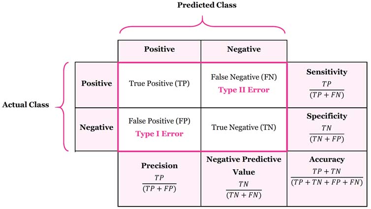
The first metric is accuracy, which measures the percentage of correct predictions (true positives and true negatives) divided by all predictions. While having an accurate model sounds great, it’s not always helpful in cases with many true negatives, such as fraud detection, where the model might correctly predict “not fraud” often simply because fraud is rare. Next is precision, the percentage of positive predictions that were correct. This metric is crucial when the cost of false positives is high, such as when an important legitimate email is flagged as spam. Sensitivity or recall measures the percentage of actual positives that were correctly identified. You want to use this when the cost of false negatives is high, such as in cancer screening, where missing a positive diagnosis could be life-threatening. Finally, Specificity measures the proportion of actual negatives that are correctly identified by the model. Using the same cancer screening example, specificity would represent the percentage of individuals correctly identified as negative by the test. High specificity is important to avoid falsely identifying healthy individuals as positive (false positives), which could lead to unnecessary stress and costs.
The process of tuning the model involves what are called hyperparameters. You can think of these as the knobs you can turn to control the behavior of an algorithm. Depending on the algorithm you choose, the hyperparameters will change. When setting up the training job, you define these hyperparameters, but tuning them is a separate step. You want to choose your objective metric—the thing you’re trying to optimize, like accuracy. Then, look at other tunable hyperparameters. You might not know the exact values, but you can specify a range and automate the search for the best parameters. The search process will identify the best combination that optimizes your objective metric. It’s important to use the validation data set aside earlier during this hyperparameter tuning step. To recap: choose your objective metric, define the ranges for your hyperparameters, and run training jobs until you find the best combination of values.
At this point, we trained, evaluated and tuned the model, and now the exciting part begins—it’s time to deploy it and make it available to the world! When deploying the model, we need to consider architecture and security best practices, and of course, keep an eye on the model’s performance once it’s live.
One of the coolest concepts we can borrow from software development is loose coupling. When you apply loose coupling to deploying a machine learning model, several strategies come into play. Instead of rolling out a monolithic application that wraps everything—model, data preprocessing, and the API for predictions—into one big bundle, you can split each component into separate microservices. Imagine one service handling data preprocessing, another hosting the machine learning model, and a third managing API requests. This way, if one service hits a snag, it won’t take down the entire application. Plus, you can update or scale each component independently, which is a huge win.
Another awesome approach is using event-driven architectures where different components talk to each other through events. For example, when new data gets uploaded to an AWS S3 bucket, it can trigger a Lambda function that preprocesses the data. Then, that processed data can kick off another event that starts the model training process. This keeps the steps of your machine learning pipeline nicely decoupled, allowing you to manage and scale each step without any headaches.
Queue-based workflows using services like Amazon SQS or Amazon MQ are also super effective. Let’s say a user requests a prediction—rather than handling it instantly, the request goes into a queue. A separate service then picks up the request from the queue, processes it with the model, and drops the result back into another queue for further action or response. This method ensures that if the prediction service gets slammed with requests or temporarily goes down, the requests are safely queued up and handled as soon as the service is back online.
And let’s not forget about the power of containers! Deploying the machine learning model in containers using Docker, and managing these containers with an orchestration service like Kubernetes or Amazon ECS, can be a game-changer. Each container can be scaled, updated, or replaced independently, without causing a ripple effect across the system. This flexibility ensures that even if one container has issues, the rest of your deployment keeps chugging along smoothly.
Once your machine learning model is deployed, the journey doesn’t end there! Monitoring its performance and evaluating its effectiveness are crucial steps to ensure it continues to operate correctly and efficiently. We’ve now reached the final step of the process, where you get to monitor and assess your deployed machine learning model.
If you’re working with AWS, CloudWatch is your go-to tool for monitoring the operational health of your model. CloudWatch keeps an eye on vital metrics like CPU usage, memory, GPU utilization, and disk utilization. By tracking these metrics, you can gain insights into the resource consumption and efficiency of your model. But that’s not all—by setting up alarms in CloudWatch, you can get instant notifications if any metric crosses a predefined threshold. This proactive approach lets you address potential issues before they start affecting your users.
Another powerhouse in the AWS arsenal is CloudTrail. This tool monitors API activity linked to your model, logging details like who made the API call, when it was made, and from which IP address. This data is incredibly valuable for security audits, troubleshooting, and ensuring that only authorized users have access to your model.
To evaluate your model’s performance, it’s essential to track key accuracy metrics like those I’ve mentioned before. These can be calculated using a confusion matrix, which breaks down the model’s predictions into true positives, true negatives, false positives, and false negatives. Analyzing this matrix helps you pinpoint where your model is making errors and whether these mistakes are tied to specific classes.
For a deeper dive into model performance, especially in binary classification problems, the Receiver Operating Characteristic (ROC) curve and the Area Under the Curve (AUC) are invaluable tools. The ROC curve plots the true positive rate against the false positive rate across various threshold settings, giving you a visual representation of your model’s ability to discriminate between positive and negative classes. The AUC, on the other hand, provides a single value that summarizes this performance—higher AUC means better discrimination, which is exactly what you want.

Even with all this monitoring in place, it’s important to remember that the performance of a machine learning model can degrade over time as the underlying data changes. Regular retraining of the model with updated data is essential to maintain its accuracy and relevance. By implementing automated retraining pipelines, you can streamline this process and ensure that your model keeps up with new patterns in the data.
Congratulations! You’ve journeyed through the entire lifecycle of a machine learning project, and what a journey it is! From the first exhilarating moments of data ingestion to the triumphant deployment of your finely tuned model, every step has been an adventure filled with learning, creativity, and innovation. This is what makes data science so exciting—the continuous cycle of exploration, experimentation, and improvement.
But the excitement doesn’t end here. The beauty of this process is that it’s a never-ending loop of discovery. Each time you cycle through, you refine your approach, sharpen your skills, and create even more powerful models. The thrill of seeing your model perform well in production, making accurate predictions, and driving real impact—there’s nothing quite like it!
So, keep that passion alive! Embrace each challenge as an opportunity to learn and grow. Continue pushing the boundaries of what’s possible with data, and remember that every iteration brings you one step closer to mastery. The world of data science is vast and full of potential, and with the right mindset, there’s no limit to what you can achieve.


Leave a comment